Friday, February 23, 2007

Bumping into a Little Creature


Was experimenting with this style of illustration - it's pretty much the same way I did Nitro and the Dragon, but I wanted flat, bright colours that are somewhat like that of a children's story book. Here we see a lady purple dreadlocks/chicken/slug thing with her elephant/polar bear/skullface husband encountering a little seal along the way.

Some people ask me where on earth do I ideas for all these characters, and the truth is... I don't really know.

I played this game with a friend once where we drew random shapes on a piece of paper and had to fill in details so the shapes made sense ... or looked like something. I guess that's how these things are conceived - your pen just randomly moves around until u chance upon something that looks good to you, then you bring your idea to life.

Unfortunately, I realise that's how I design many other things as well - banking on pure chance and intuition, then riding the wave once you catch onto something. That's BAD when it comes to more function-driven design, for the record.

Saturday, February 17, 2007

Spatial Calendar

This is one idea of that I had that I was pretty interested in developing.


When you look at a calendar, you see equally spaced, boring blocks of empty space waiting to be filled in with activity. Because of the way you see these uniform blocks, it drives you to live your life in this routine way, forcing you to conform to a activity-time grid that determines your life.


What if you changed the way you looked at the days? Some days seems shorter, longer, more hopeful, exciting, constricting, inextricably linked with other events in time on other days. Here's a calendar that encourages the living of a non-conformist, non-routine life:


Seriously, don't ask me how it works. Just know that every week has 7 days.

Mutation's Abound


Here's another plant from my series. It's inspired by the fusion of 3 things - a Zen Garden, a cactus and a faucet, thus I call this a "Faucet Cactus". I guess what these three things have in common is the idea of balance. The Zen Garden inspires balance, the existence of the cactus is a result of balance in a harsh climate, and the faucet is a tool to balance an equilibrium of flow.

(Man, this guy is really good at crapping the shit out of nothing.)


The result? Something that seems really at peace with itself and its flat stone base that it grows from. Enjoy.


Friday, February 16, 2007

Party Pills!


When you feel like partying, you bring out the booze.
When you feel like partayyyyy-ing, you bring out the disco ball and a flashing dance floor.
When you REALLY feel like partayyyyyy-ing..... bring out the PARTY PILLS!

QB: Say YEAAHH!
People: YEAHHH!
QB: What you wanna do??
People: PARTYYY!
QB: What you wanna doooooo??
People: PARRRTTYYYY!!
Retarded Amoeba: Mambobobo-chi.
People: MAMBO!
Retarded Amoeba: Chachagoogoo..
People: CHACHA!

*Frenetic Latin music plays in the background*

Disclaimer:
Plastikk-cube is in no way endorsing the use of drugs in any form, and instead encourages the consumption of healthy alternatives like Tic-tacs.


Thursday, February 8, 2007

Liar Liar Great Balls of Fire

Ok I lied about the last post being the ONLY panel. This is the 2nd scene where he reaches a tavern in the desert town. His spidery camel has 7(!!) legs. "All the better to walk with, my dear."


The Quest of Ears

I have 2 really really bad tendencies which kind of screw up many many things in life.

1: I tend to have inertia in getting something started because I'm stuck or lazy. (like NOW)
2: I get something started really well, then I give up halfway or get lazy again.

This thing I'm showing here falls into the latter category. It's a vision that I had of starting a comic strip of a roguish guy with Big Ears who has some great task to do that ultimately causes accidental harm to people and creatures he comes across. Here is the very 1st panel and the only panel that I did after a gave up, realising the sheer amount of work that goes into this shit.

The setting is very fantasy-like, and the 1st scene would be a desert town run by red piggish things. Notice the details like the "egg-plant", the strange way of writing (in varying sizes of circles on a line) and stuff.


Tuesday, February 6, 2007

Things You'd Probably See After Sniffing Too Much UHU Glue

Nitro is a fat dinosaur.
He loves bright colourful things like sunflowers and rockets, although everyone tells him sunflowers and rockets don't go together.
However, Nitro knows that on the Moon is a huge field with bright yellow sunflowers.
With his large red rocket strapped to his back, he hopes that someday someday, someone will light his bright red rocket so he blast off and fly to the Great Sunflower Field on the Moon.


The Dragon has had small wings for as long as he remembers.
He doesn't mind them, but sometimes they get caught in the leaves as he soars through the branches of trees in the rainforest that he lives in.
He sleeps a lot, mostly upside-down in a banyan tree.


Pokyu the Pufferfish

As promised, here is Pokyu! Ernest approached me to co-design a package for a dehumidifying product that his aunt was promoting, some silica stuff. We came up with the idea of Japanese-looking packaging with a puffer fish mascot. You know, the fish soaks up water and puffs up...
Basically the idea was to make it as "Japanese" as possible, thus the jap words and the rectangle eyes for the cuddly fish. So here's the front of the packet:


Friday, February 2, 2007

Retarded Amoeba

When in despair, ask the great Retarded Amoeba for valuable advice and It will bestow it upon you.

How to Get a Design Concept: The Secret Manual

Ok this is something important for all archi people: the ultimate guide to getting an architectural concept for your design, compiled after my detailed analysis and understanding of NUS archi student's work. After reading this, you should have absolutely NO problem with a design concept!

Step One:
Whatever your program/art/school or whatever you're doing, even if it's a Dog Lover's Hostel or Ketupat-making school, just tell your tutor your design is about LAYERING. Then just link it to whatever you have.
e.g. Ketupats are woven with leaves creating LAYERS, so my concept is about layering.
e.g. Indian cuisine is about many smells and tastes, thus the idea of LAYERING.
e.g. When a dog craps on the ground, the poo, the grass, and soil form inextricable LAYERS.

Step Two:
Be sure to make it look CHEEM! Use common catchphrases that will leave the tutors nodding their heads in approval like:

1. This blurs the boundaries between the inside and the outside.
2. This takes the user on a journey through a series of orchestrated spaces.
3. This creates interesting nodes and spaces for people to gather.
4. This creates a sense of suspense as **** is suggested but not fully revealed.

Step Three:
Use cool tutor-approved words! Why say "put together" when you can sound pro with "juxtapose"? Why be stuck with the word "filter" when you can use a 3-syllabled word like "percolate"? The key to success is confusion.... don't forget!

Step Four:
When all else fails, use the Universally Approved Concept Statement that applies for every single damned design that you see:

"My design explores and challenges the relationship between Man, Nature, and the building by creating spaces that encourage activity and interaction among the users of the building. This is done by orchestrating a sequence of interesting spaces that slowly reveal themselves as the user moves through the building."

Be sure to add a series of diagrams that you directly scanned in from an obscure book, adding in lots of arrows and text that no-one would bother to read. To top it off, draw a HUGE pencil drawing (do spend more time on this) of your Ketupat or Dog, which would take up half of your concept panel.

Cool! Now you have a CONCEPT!

Thursday, February 1, 2007

Bulbous Floater

Q: What happens when you place an onion in a fish tank?

A:

QB's Photoshop Clinic #1

Thanks all for your kind comments on my art blog! To make it more worthwhile for you guys to visit, I've decided to start QB's Photoshop Clinic to reveal all the tricks and secrets of my very limited arsenal of Photoshop tricks. Haha!

Instantaneous Pop-Art Transformation (Difficulty Rating: 1 star)

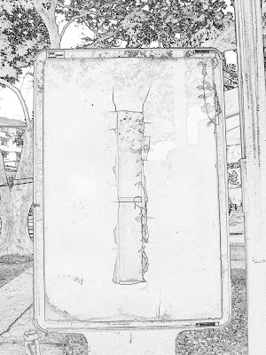
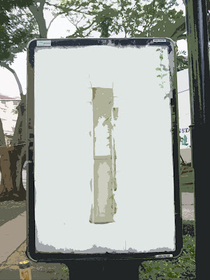
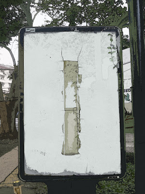
1st up is a simple effect that demonstrates the use of 2 of my favourite filters in Photoshop: Cut-out and Find Edges. Application of these 2 filters would almost guarantee an artsy Andy Warhol-ish poster look that I really like and use a lot.

1st up: the original photo


This is a pretty cool photo I took of those advertisement boxes you find at bus stops - only that this one is broken and has a creeper growing within the glass... looking like some abstract advertisement for perfume or something.

Duplicate your photo layer.
Apply a FIND EDGES filter on your top layer and it should look like this after you DESATURATE the layer.


This process creates an outline effect that is very commonly used by Architecture students to fool tutors into thinking their photos are actually hand-drawn, in particular studies involving serial vision.

Apply a CUTOUT filter on your bottom layer and you should get this cool effect when you turn off the visibility of the top layer:


Turn on the visibility of the top layer then turn the blending mode to MULTIPLY and wow, you get this: